HTML and CSS Reference
In-Depth Information
Listing 10-16.
Styling the main navigation links.
#nav-main a:link,
#nav-main a:visited {
display: block;
padding: .25em 10px;
text-decoration: none;
}
#nav-main a:hover,
#nav-main a:focus,
#nav-main a:active {
background: #f90;
background: rgba(255,153,0,.3);
text-decoration: underline;
}
Ordinarily, padding an inline element has little effect on how it behaves in a page layout, and other
elements around them may not respect that padding, treating the element as if it weren't padded at all.
Setting these navigation links to
display:block
makes them render as block-level elements, filling the
space of their containing element—or to state it more accurately, it forces the outer elements to expand
around the block-level elements within.
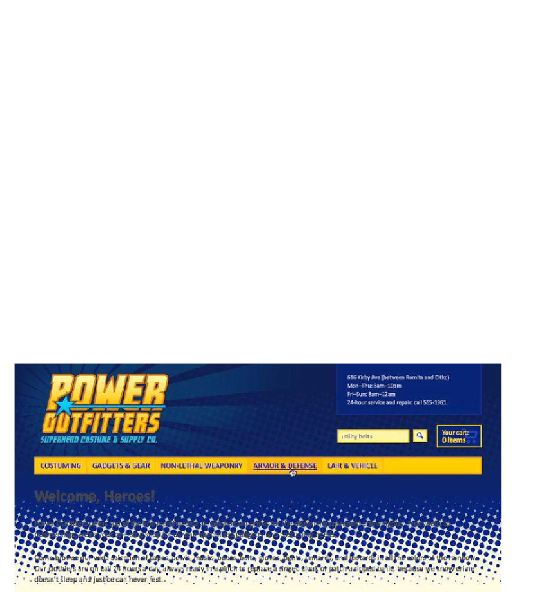
As you can see in Figure 10-9, the navigation links now take up a bit more space and offer much larger
targets for clicking and tapping. The link's entire background, including the padded area, fills in with a solid
color when the link becomes active.
Figure 10-9.
The finished navigation bar separates the masthead from the content below (we'll be working on that
content next).