HTML and CSS Reference
In-Depth Information
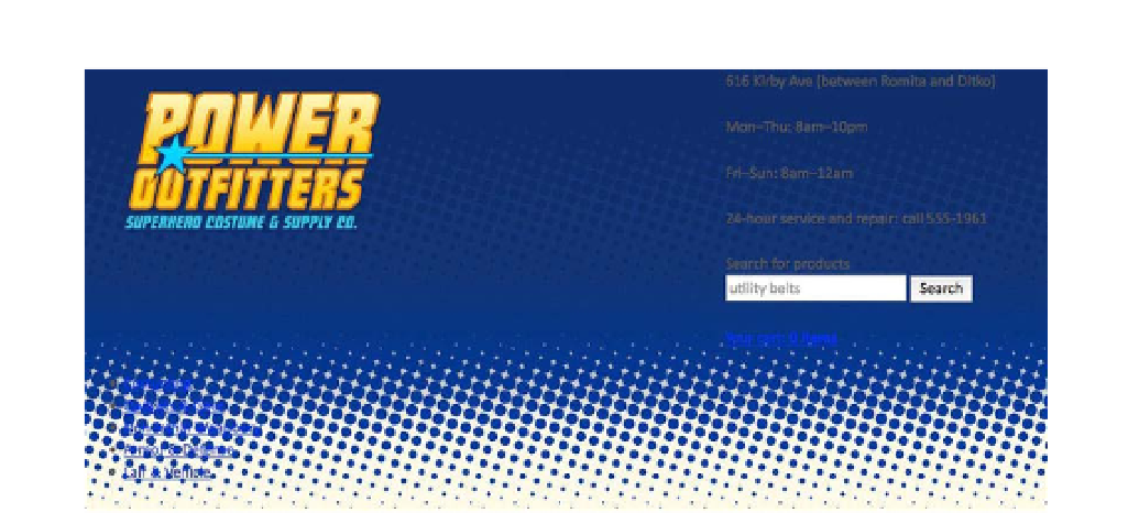
Figure 10-6.
The masthead as it's styled so far, which isn't very far at all
The Store Info and Utilities
Any website for a brick-and-mortar business—like restaurants, mechanics, antique shops, beauty parlors,
or the local comic book store—should prominently feature the business' address, hours of operation, and
perhaps a phone number in a place where it's easy to find. If you want customers to come to your door
they'll first need to know where your door is and when it's open. It's just common sense.
Power Outfitters' store information is a collection of paragraphs wrapped in a
div
element right there at the
very top of the page. We want it to be easy to spot, but it shouldn't overtake its neighboring content; it
shouldn't compete for attention with the logo, search form, and cart link. We'll give the store info some
subtle presence by decorating the box it appears in, but not so much that it leaps off the screen. It just
needs a little padding, a border, and some text styling.
Listing 10-13 shows our styling for the store info box. The negative top margin pulls the top of the box up
beyond the top edge of the window to hide the box's top border, and the generous top padding pushes the
text down into view. The combined effect is of a box that appears to hang from the top of the window like a
shingle. Also note that we haven't added any left or right padding because it would be added to the box's
declared width. Instead of trying to adjust the width to compensate for padding, we've added left and right
margins to the paragraphs within the box to achieve the same spacing.
Listing 10-13.
The CSS rules that style the store info box in the Power Outfitters masthead
#store-info {
width: 32%;
min-width: 260px;
float: right;
clear: right;
padding: 38px 0 15px;
margin: -20px 0 20px;
border: 2px solid #0c2d8c;
background: #102562;