HTML and CSS Reference
In-Depth Information
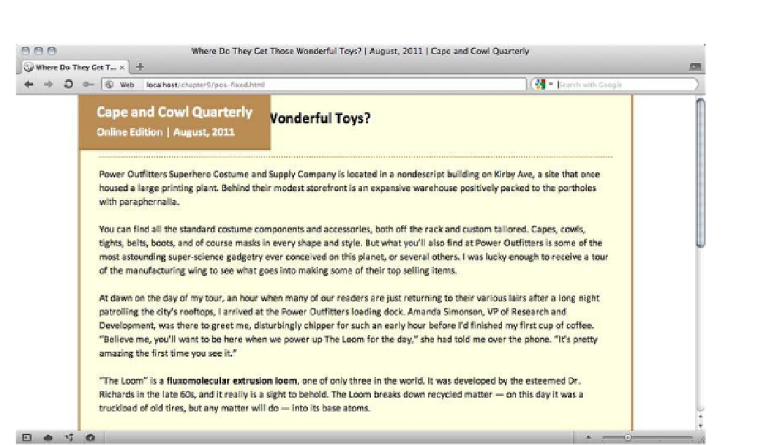
Figure 9-22.
After positioning the masthead out of the normal flow, the masthead collapses and the rest of the content
flows up under it
Without a declared width, positioned elements collapse to the width of their contents. This “shrink-wrap
effect” isn't always obvious because the contents may still follow the normal flow; if our title were longer,
the collapsed box would be wider. If the element held enough text to fill the space, the box might not
appear to be collapsed at all. Absolutely positioned elements collapse as well, but the previous examples
used images with inherent widths already so there were no ill effects of the shrink-wrap effect. But with our
short title the collapse is clear, and clearly undesirable.
The shrink-wrap effect is easily remedied with a
width
property, but we need to compensate for the
overlapping masthead by padding the top of the article under it, reserving some space for the masthead to
occupy when the page first loads and the reader hasn't yet scrolled downward.
The padding needs to be slightly greater than the height of the masthead, pushing the article's title down
the page. However, the masthead's height is dictated by the height of its content, which is just ordinary
text, making the actual rendered height hard to predict. Even though we've specified a size for the text,
users can still change the font size if they like. You should usually avoid setting fixed heights for any
elements that contain text, but in this particular case it's unlikely that the text will need to wrap to multiple
lines so we can probably risk it. Different content or a different design might lead us to a different layout
strategy, but this will work well enough for demonstration.
We'll still accommodate varying font sizes by defining the height and padding in ems, a unit proportional to
the size of the text. This way, if the font size changes, so will the height of the masthead and the padded