HTML and CSS Reference
In-Depth Information
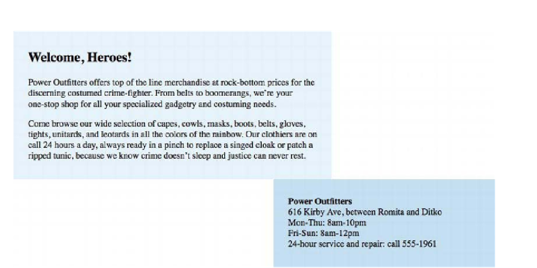
Figure 9-6.
When floating elements are too wide to fit in the available space, later floating elements drop under previous
floating elements.
If two elements are floating next to each other and one (or both) of them becomes too wide for the
containing element to accommodate them together, the floating boxes will collide and whichever element
comes later in the source order will wrap under the previous element. Think of the boxes as two giant
words and you'll see they wrap to new lines the same way text does when it runs out of room. (This is also
true with any number of floating boxes; if there isn't enough width for all of them to line up, later boxes will
wrap under previous boxes.)
You can prevent disastrous “float drop” by ensuring that the elements' combined widths never exceed their
container's width. To make sure these floating boxes remain side by side, we'll need to adjust their widths
to accommodate the padding. We can even make them a bit narrower than strictly necessary to leave a
nice gutter between the columns (see Figure 9-7):
.main {
width: 52%;
float: left;
background-color: #e6f2f9;
padding: 15px 3%;
}
.extra {
width: 32%;
float: right;
background-color: #c3deee;
padding: 15px 3%;
}