HTML and CSS Reference
In-Depth Information
Listing 9-2.
Applying opposite floats to form adjacent columns
.main {
width: 60%;
float: left;
background-color: #e6f2f9;
}
.extra {
width: 40%;
float: right;
background-color: #c3deee;
}
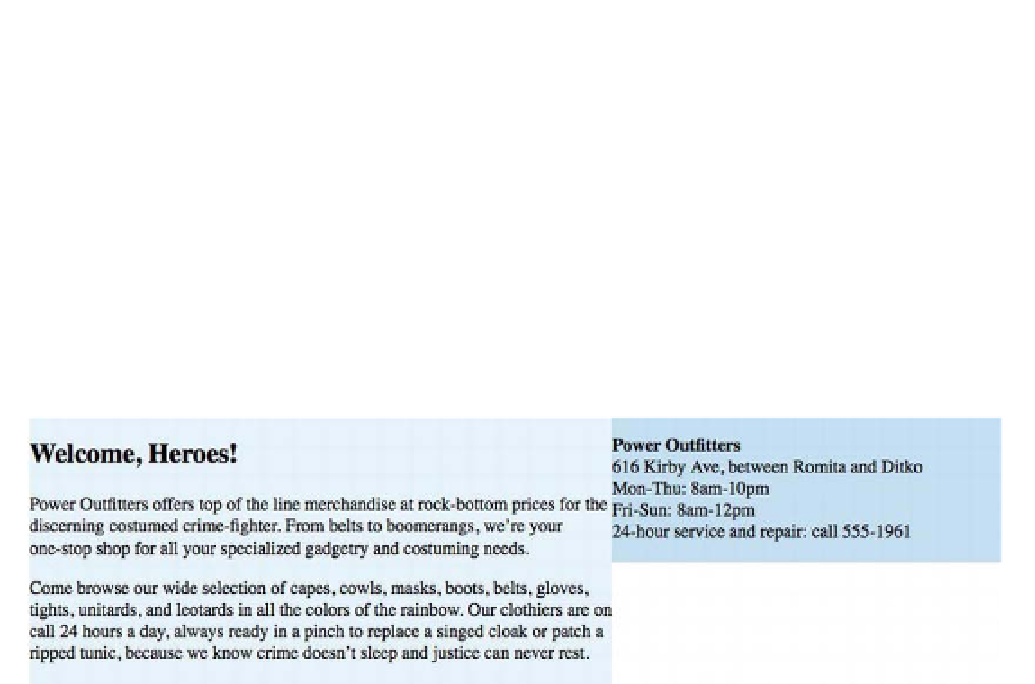
Figure 9-5.
The two floated
section
s form two columns
Not a bad start, but those boxes look a bit cramped and in need of some padding. We'll use percentages
for the side padding, to keep our overall width liquid:
.main {
width: 60%;
float: left;
background-color: #e6f2f9;
padding: 15px 3%;
}
.extra {
width: 40%;
float: right;
background-color: #c3deee;
padding: 15px 3%;
}
But now there's a problem, as you can see in Figure 9-6: the second box drops below the first. That's
because padding is
added to
the declared width, so our two boxes are each now wider by 6% (3% padding
on each side). Added together, the two boxes are wider than the available space—66% plus 46% is
112%—so the second box wraps under the first.