HTML and CSS Reference
In-Depth Information
Liquid Width
A liquid width layout (also called
fluid
or
dynamic
) has its width specified using percentages rather than
fixed lengths. The outermost containing element—perhaps the
body
element but it could be some other
container—is given a width that is a percentage of the browser window, and any elements inside it are
given percentage widths based on the width of that container. The entire page can automatically adjust to
fit whatever window width each viewer prefers (or that her device dictates), returning some control to the
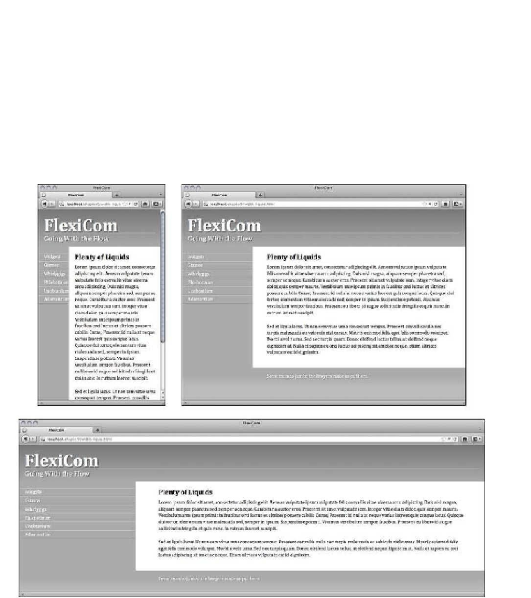
user. Figure 9-4 shows the same liquid layout page in three different windows, each time adjusting to the
environment and rearranging the content to fit. But allowing for that much flexibility can be a chore for the
developer; there are many more ways it can go wrong.
Figure 9-4.
A liquid width layout in three different window widths