HTML and CSS Reference
In-Depth Information
Listing 8-7 is an example of a reservation form with separate inputs for date and time. Because you can't
make an appointment in the past (unless you're a time traveler), the date field has a minimum value that is
the same as today's date, which would probably need to be generated automatically by a script or server-
side code (just pretend you're reading this on July 22 of 2012… unless you're a time traveler).
Listing 8-7.
Using date and time inputs in a reservation form
<fieldset>
<legend>Schedule a Costume Fitting</legend>
<p><label for="fit-date">Date</label>
<input type="date" id="fit-date" name="fit-date" min="2012-07-22"></p>
<p><label for="fit-time">Time</label>
<input type="time" id="fit-time" name="fit-time" min="08:00" max="18:00"></p>
</fieldset>
This time field has both a minimum and maximum value so this form can only accept appointments during
business hours. However, time inputs don't carry any indication of AM or PM, so we've specified a 24-hour
clock instead of a 12-hour clock. Otherwise a maximum value of
06:00
(for 6 PM) would be treated as
less
than the
08:00
(8 AM) minimum, which isn't allowed. When the
min
and
max
attributes are both present, a
minimum can't be greater than a maximum, and a maximum can't be less than a minimum. It just makes
sense.
input type="color"
This new-in-HTML5 input type allows a user to provide a color value via a handy color picker interface.
The input's value is a hexadecimal color code, but the graphical interface of the control is left up to the
browser; the HTML5 spec doesn't prescribe any particular design for the color picker. At the time we write
this, Opera is the only major desktop browser that supports
input type="color"
and their picker
interface is quite simple (see Figure 8-9).
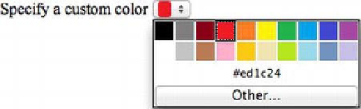
Figure 8-9.
A color input as displayed by Opera (this is on OS X)
When the input is in focus, Opera displays a small dropdown palette of color swatches for a predetermined
set of common, basic colors (black, white, red, yellow, blue, etc.) or you can provide a customized set of
swatches using the
datalist
element, covered later in this chapter. The swatch palette also includes an
“Other…” button that invokes the operating system's native color picker. The input's current hex code
value appears in the palette as well. The unfocused input manifests as a small selection control, filled with
a single swatch displaying the current color.
Browsers that don't support the color input fall back to a default text field that can still accept a
hexadecimal color code. In fact, the value of an
input type="color"
must
be a hexadecimal color code;