HTML and CSS Reference
In-Depth Information
a:hover {
color: #cccc00;
}
a:focus {
outline: 1px dashed #cc0000;
}
a:active {
color: #0000cc;
}
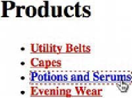
Figure 6-8 shows that this code changes the color of an active link to blue.
Figure 6-8.
Browser output of the active state of an anchor element styled with CSS
You'll also notice that the
:focus
styling gets applied to our active link.
It's important to note that the order in which you declare these pseudo-classes matters. It matters so
much, in fact, that there's a mnemonic device to help you remember the ordering: LoVe/HAte. Or, LVHA,
short for
:link
,
:visited
,
:hover
, and
:active
. It's silly, yes, but we guarantee you'll remember it.
Ordering of link pseudo-classes is another example of using the cascading characteristics of CSS to our
advantage. Using the LVHA mnemonic, an anchor's
:visited
styles would override its default
:link
styles and both of those styles would be overridden by
:hover
and
:active
styles.
The logic behind this ordering is actually quite simple. During the course of a user's interaction with a
website, each link he or she interacts with goes through a particular life cycle. Assuming the user is new to
the site, each link exists in its default
:link
state. This state naturally precedes the
:visited
state.
Similarly, the
:hover
and
:focus
states naturally occur before the
:active
state.
Button-making
If you've spent any appreciable amount of time on the Web—and who hasn't at this point?—you've
undoubtedly noticed that not all links are styled as underlined text. The Web is chock full of ornately
designed buttons that you can click on. In a lot of these cases, there are anchor elements under the hood
styled to look like buttons.
In this example, we'll show you how to style an anchor element to resemble a clickable button. Listing 6-25
and Listing 6-26 detail the markup and CSS needed for this example.