Graphics Reference
In-Depth Information
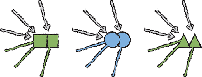
Circles easily outperform other shapes like squares and triangles as shown
in
Figure 16-2
. However, the airline network visualization shown in
Figure
16-1
serves as an illustration of the value of using symbols over abstract
shapes altogether. Using airport codes in this case makes each of them
immediately identifiable while maintaining a relatively compact shape.
Figure 16-2:
Circles centered on the node coordinate outperform all other
abstract shapes. They are easily perceived as discrete shapes, unlike the
squares here, and their clear centroid and equidistance from it forms a
perfect graphic relationship with links, making it clear what connects to
what.
Symbols
Striving for “recognition rather than recall” (as phrased by usability expert
Jakob Nielson in 1995) is a fundamental strategy for improving
visualization. It is also one that is often overlooked. For example, the use
of arbitrary colors and abstract shapes is common practice but requires
an analyst to learn and recall the unrelated mapping between visual and
real-world elements to decode a visualization. This can be a significant
source of friction in comprehension. Legends are useful and important, but
they are not a cure-all for poor design.
The use of symbols increases the chance that an analyst will immediately
recognize what's being presented, improving the analyst's ability to perceive
information. Even in cases when recognition is not immediate, symbols
provide a mnemonic for more easily remembering the mapping. For
example, in
Figure 16-1
, you might not immediately recognize the airport
symbol MCO, but once informed, it is easier to remember that MCO