Graphics Reference
In-Depth Information
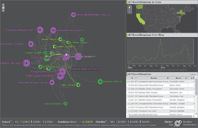
Figure 14-10
showshowtheuseofsized rings that represent thedistribution
of community members can portray more about the nature of a community
and its relationships than would a traditional plot of all nodes. In this
Aperture JS example, anonymous communities of donors shown in green
representthosewhocontributetocommunitiesofcharitiesshowninpurple.
Each community is subdivided by the proportion of members in each level
of “wealth” (how much they send or receive). More intensity in the color
indicates greater wealth.
Figure 14-10:
Community rings visually express characteristic
distribution of their members. Here, anonymous donor and charity
communities reflect size and makeup with links expressing flow of funds
between them. When you click communities, you see additional
information about their geographic makeup and financial activity in linked
panes on the right.
Preserving the representation of the distribution of members provides a
clear view of communities and their boundaries. It also makes it easier to
interact with them and see characteristics of the links between them. In
Figure 14-10
,
the links represent flow of money. You can click a community
to explore more information—in this case, showing its geographic makeup