Graphics Reference
In-Depth Information
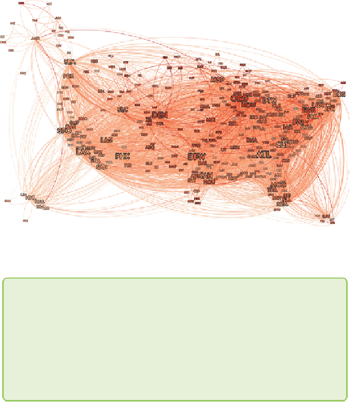
Figure 13-10:
Visualizing average flight delays geospatially across all
airports reveals interesting patterns. Here, label size indicates the size of
airport, and red indicates greater average delay for December 2013.
Note
As of this writing, Gephi did not yet have controls for sorting nodes or
links back to front, nor was it controlled by the data. To draw airports
and routes with higher delays over the top of those with less, the
authors wrote a quick Gephi plug-in in Java. The popularity of Gephi
among researchers (along with the somewhat organic, unplanned feel
of the user interface) can be attributed in no small part to its extensive
plug-in architecture.
Examining some of the best-performing airports closely like Seattle (SEA),
Portland (PDX), and Salt Lake City (SLC), you may notice that the few
incoming flights that do tend to be delayed involve airports where the issue
is much more prevalent. Overall, several broad trends also emerge.
One is that the middle of the country, north to south, is delayed more
frequently than either theEastCoastorWestCoast.Thisisamore prevalent