Graphics Reference
In-Depth Information
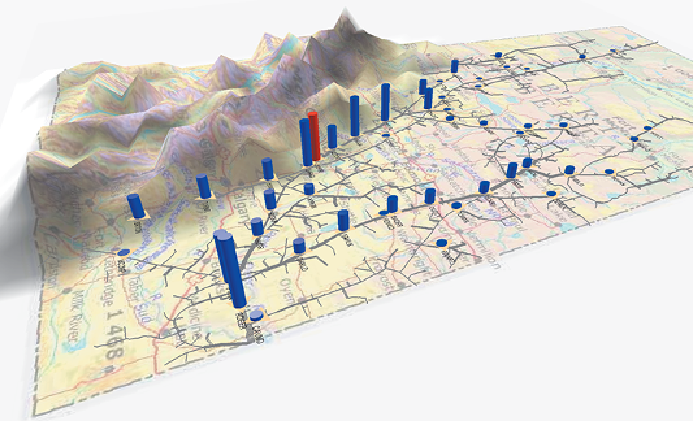
to its limits, and alerts (such as a fault in a mechanical compressor). The
alert-based system provided one way to easily monitor the system: no alerts
equals no problem.
The solution provided was a graph visualization roughly along the lines of
theoneshownin
Figure 1-7
.
Thelinks weresized basedonpipeline capacity,
with nodes indicating flow through the station as a 3D bar, colored the node
based on the limits (for example, blue for not close to limit and red for close
to, or exceeding, limit), and added a significant red flag on top of the node if
an alert was triggered.
Figure 1-7:
As shown in this pipeline graph, gas generally flows from the
north (top of image) to the south (bottom left).
One interesting incident occurred shortly after we had completed an early
version of the visualization. The alert system had no active alarms. But
the visualization showed one compressor station operating close to it limits
with a high volume going through the station (red in the figure). Inspecting
all the node attributes associated with that station via a tooltip indicated
no particular problems other than the station was working very hard and
close to its limits. Having the whole graph visible meant that the analysts
could visually inspect all the neighboring nodes for clues. One of the nodes