Graphics Reference
In-Depth Information
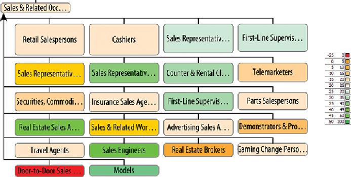
Figure 5-8:
Sales occupations in the United States are colored by percent
change in income from 2001 to 2010, using a diverging color scale centered
at 25 percent—the inflation over the same period. Gray indicates no data.
In this example, it is easy to see that door-to-door sales' incomes have
decreased the most, while models' incomes have significantly increased.
Most sales occupations are light orange, indicating a modest increase in
wages, but a bit less than the level of inflation over the same period. A larger
version with all the occupations is available in the Supplementary Materials
on this topic's companion website.
Categories
Many different kinds of categories exist: professions, gender, religion, tags,
and so on. Any quantity can be turned into a category, too—for example,
age can be turned into a few age groups. Using color to show categories
is effective for up to ten or so categories—because each color needs to
be clearly distinguishable from other colors. Recall that people perceive
brightnessasastrongcue,socolorchoicesforcategoriesshouldleveragethe
natural brightness associated with different hues, as shown in
Figure 5-9
.