Graphics Reference
In-Depth Information
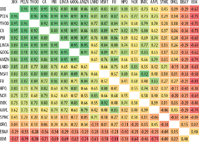
In the example shown in
Figure 4-21
, the colored matrix indicates all the
edges between every pair of stocks. The diagonal is white—these are
self-loops and not relevant in this analysis. The number in the cell is the
correlation, which ranges from negative one to positive one, and can be
considered an edge weight.
For a directed graph, the rows represent source nodes and the columns
represent target nodes. The colors of the cells on either side of the diagonal
will be different. For an undirected graph, the colors are symmetric across
the diagonal, and the lower diagonal does not need to be drawn.
Figure 4-21:
This adjacency matrix shows stock correlations. All edges are
equally visible.
Matrix diagrams can be effective when the graph is fairly dense and where
the goal is to analyze links. For an analyst trying to understand which stocks
are strongly correlated and which are not (see the
Stock
example data set),
the task is focused on all the edges. The matrix diagram in
Figure 4-22