Geography Reference
In-Depth Information
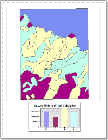
FIGURE 3-16
51.
Right-click on the title bar of the graph, and click Add To Layout. Dismiss the graph window as well
as the Sum_Output_x table. In the Layout View, drag the graph to the bottom of the page. Using the
handles on soils_polygon, resize and move it so that it doesn't conflict with the graph. Click Zoom
whole page. Adjust each map element so that a reasonable amount of layout space is devoted to
the data and the graph. It should look somewhat like Figure 3-17. Title the map Soil Suitabilities.
(Optional) It would be helpful if the soils map showed the polygons with the same colors as the graph.
Unfortunately, the best way to do this is by changing the individual colors on the feature class. If you want
to take the time, try changing the random colors assigned in the T/C so that they more or less match
those of the graph. Start by clicking the color patch next to the zero value and making it the same color as
the zero column on the graph (using the fill color in the color selector window. Or, to be meticulous, click
More Colors…). Do the same for values one, two, and three. Click Apply, then OK.
Save the map in
___IGIS-Arc_
YourInitials
\Map_Making.
with the name Soils_with_Graph_1.
Suppose that you want to see the relative amount of each suitability. A pie chart will serve this function.
FIGURE 3-17


Search WWH ::

Custom Search