Information Technology Reference
In-Depth Information
Migration Flows
Between Britain's
European Regions
Various attempts to cope with the complexity
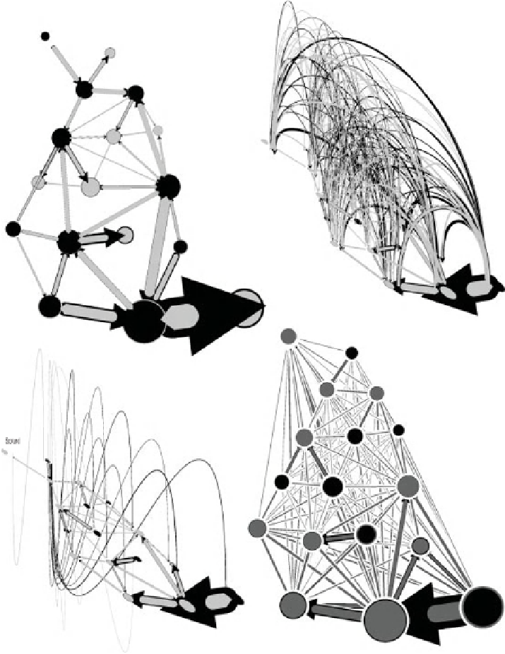
Arrow head shows net migration direaction. Circle, where shown,
and line sizes are proportional to the absolute numbers of migrants.
Black is inflow. Grey is outflow. Outer colour includes any inner.
Between 1975 and 1976
All Migration Flows between
All Regions with a 3D effect
Flows between Ajacent
Regions appear
horizontal
Migration Flows Routed by
Shortest Path through
Ajacent Regions and
Summated
All Migration Flows
Between All Regions
sorted by contiguity
and outlined
All Migration Flows from and to
Tyne and Wear shown in 3D
Only Flows Between Adjacent
Regions shown otherwise
which appear horizontal
Flows between
Adjacent Regions
appear on top
Figure 6.2 When flows are artificially routed through areas it looks as if far
more people move to London (top left diagram). Don't route them, but drop them
in as curved lines (top right) and it is clear more people leave London for the
South East. Simplify that map and you lose too much detail (bottom left). None of
these are an improvement on the previous figure, also shown here (bottom right).


Search WWH ::

Custom Search