HTML and CSS Reference
In-Depth Information
CSS media queries
A flexible container is quite powerful and it is the core CSS technology that components specific to
Windows 8 are based on, such as
GridView, ListView,
and
SemanticZoom
. Suppose now you increase
the font size for all child elements. You can easily do that by opening the
default.css
file and making
the following change in the
.flexible-container
class.
.flexible-container {
font-size: 3em; // former value was 2em
...
}
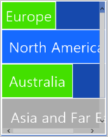
You may not experience particular problems except when the application is snapped (see Figure 8-12).
FIGURE 8-12
A larger font forces the use of scrollbars in snapped mode.
The use of scrollbars is necessary to make excess content visible. Is there a way to automatically
adjust some CSS styles when the application goes in snapped mode? You bet; this is precisely the
purpose of CSS media queries. You briefly touched on CSS media queries in Chapter 3, “Making sense
of CSS.”
A CSS media query is a query expressed on some run-time conditions that instruct the browser
to pick up a particular CSS file. You can define a media query using a
LINK
element (as discussed
in Chapter 3) or by directly embedding it in the CSS file. This is the standard approach followed by
Windows Store applications.
Every time a new project is created, the
default.css
file contains the following CSS code:
@media screen and (-ms-view-state: fullscreen-landscape) {
}
@media screen and (-ms-view-state: filled) {
Search WWH ::

Custom Search