HTML and CSS Reference
In-Depth Information
that are checked, or display disabled elements in a specific way. These pseudo-classes are listed in Table
13-3.
Table 13-3.
Element-State Pseudo-Classes
Pseudo-Class
Description
:enabled
Matches any form field that is enabled
:disabled
Matches any form field that is disabled
:checked
Matches any form field that is checked
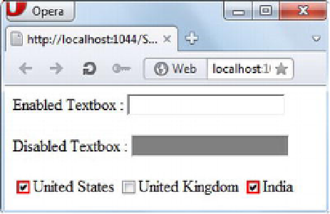
To understand how element-state pseudo-classes are used, consider the following selectors:
input[type="text"]:enabled { background:#fff; }
input[type="text"]:disabled { background:#808080; }
input:checked { border:2px #f00 solid; }
The
:enabled
pseudo-class, when applied to input elements of type
text
, returns all text boxes that are
enabled and applies the specified styling to them. Similarly, the
:disabled
pseudo-class selects all text
boxes that are disabled and applies the specified styling. The
:checked
pseudo-class selects all check boxes
and adds a border to them as specified. Figure 13-5 shows these pseudo-classes in action.
Figure 13-5.
:enabled
,
:disabled
, and
:checked
pseudo-classes in action
Miscellaneous Pseudo-Classes
The CSS pseudo-classes discussed in this section don't fit in any of the categories discussed earlier. These
pseudo-classes include the negation pseudo-class (
:not()
) and the general sibling combinator pseudo-
class.
The negation pseudo-class is used when you wish to select elements that don't match a specific
condition. For example, suppose a form contains several
<input>
elements. Of all those
<input>
elements,
only one is of type
submit
; all the rest are of type
text
,
checkbox
, and
radio
. If you wish to apply styling to
all of the
<input>
elements except the Submit button, you can do so using the
:not()
pseudo-class as
shown next:
input:not([type="submit"]) {
background-color:#808080;
}