Game Development Reference
In-Depth Information
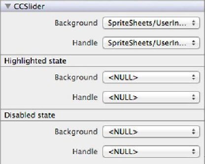
change the images associated with the slider's background (the stretchable line) and the
slider's handle.
Figure 7-11
.
Slider image settings
Change the
Background
image to
SpriteSheets/UserInterface/S_bar.png
, and set the
Handle
image to
SpriteSheets/UserInterface/S_ball.png
for the normal state (the topmost
setting in
Figure 7-11
)
.
Set both the
Background
and
Handle
images to
<NULL>
for the
Highlighted State
. This
means the highlighted state—the state while the user is dragging the handle—will use the
same images as the normal state.
Note that the slider background image should have a specific size, since it is stretched as
needed. This goes for other stretchable
CCControl
images as well, such as the button
background image. Internally, the slider and button use the
CCSprite 9 Slice
node for the
images; however, that sprite's properties are not exposed. So if you use an incorrectly
sized slider or button background image, it will look anywhere between “not quite cor-
rect” to abhorrent—or just not what it's supposed to look like.
You will find the default slider and button images in any SpriteBuilder project in the
ccbResources
folder if you need to look up the sizes of the built-in images.
The
ccbSliderBgNormal.png
and
ccbSliderBgHighlighted.png
images are used as the
slider's default background images. The images are 28x10 pixels in size but have their
Scale from
property (shown in
Figure 3-8
in
Chapter 3
) set to 2x. You can use the 28x10
size for your own background images and set the
Scale from
property for those images to
Search WWH ::

Custom Search