HTML and CSS Reference
In-Depth Information
shorthand version to set all three at
once:
body {
column-width: 200px;
column-gap: 100px;
column-rule: 4px dashed #333;
}
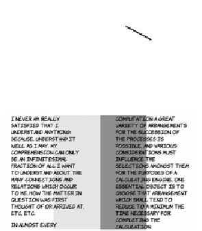
Note that the column rule sits within the column gap—increasing or
decreasing the width of the column rule doesn't move the columns
farther apart or closer together. You can even have the column rule
extend underneath the columns, as in the following example.
In this example, the column rule
is wider than the column gap:
body {
column-width: 200px;
column-gap: 100px;
column-rule: 300px ridge
#ccc;
}
Wrapping and overflow
Text wrapping has traditionally been something that, as a web author,
you had to let the browser take care of. In situations where you'd like
more control,
CSS3
offers a couple of new properties:
word-wrap
and
text-overflow
. This section looks at each in turn.
Word wrap
CSS3
provides a
word-wrap
property that controls whether line breaks
are allowed in the middle of words. Normally, text wrapping only
occurs at spaces and punctuation. If a word is too long to fit inside the
containing element without the opportunity for a break, then the ele-
ment expands to contain it.