HTML and CSS Reference
In-Depth Information
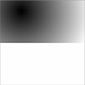
This does let you see another property of radial
gradients: by default they're ellipsoid rather than
circular. You haven't noticed until now because
you've been applying them to square elements.
You can make the gradient circular using the
circle
keyword:
background: radial-gradient(
circle at 25% 25%, #000, #fff
) no-repeat;
background-size: 100% 50%;
Note that the specification allows you to specify a size for the gradient
within the gradient itself. One of the reasons the
to
and
at
keywords were
added was to allow lengths for sizing to be added unambiguously
alongside the position. However, as yet no browser supports this syntax,
so currently it's more reliable to use
background-size
.
It's also possible to layer multiple gradients if you
use
RGBA
colors. Here's a radial gradient over a
linear gradient to create a highlight effect:
background: radial-gradient(
circle at 25% 25%,
rgba(255,255,255,0.75),
rgba(255,255,255,0)
) no-repeat,
linear-gradient(
to bottom, #000, #fff
) no-repeat;
There's no reason your gradient can't have the
same starting and ending colors. This example
modifies the final example from “Multiple back-
grounds” to use a gradient instead of loading an
extra image from the server:
background: top right
url('pitr-head.png') no-repeat,