HTML and CSS Reference
In-Depth Information
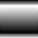
Finally, if you don't want the color stops to be
evenly spaced, you can give percentage values
for each color stop:
background: linear-gradient(
to bottom,
#000,
#fff 15%,
#000 85%,
#fff
);
Linear gradients are all very well, but sometimes you want a more
circular effect—for example, a spot highlight on a glassy button.
CSS3 lets you create radial gradients; we'll look at them now.
Radial gradients are as simple as linear gradients.
You supply a start color and an end color:
background: radial-gradient(
#000, #fff
);
The gradient starts at the center and extends to
the boundary of whatever element it's applied to.
You can achieve more interesting effects by posi-
tioning the center of the gradient:
background: radial-gradient(
at top, #000, #fff
);
The
at
keyword is used to specify the center point.
The gradient center can be positioned anywhere:
background: radial-gradient(
at 25% 25%, #000, #fff
);