HTML and CSS Reference
In-Depth Information
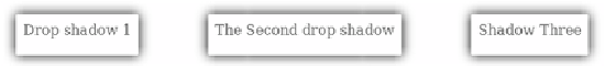
The border image, as with the buttons, adapts to the size of the content.
You've already seen the direct support for
box shadows in
CSS3
, but they can also be
achieved with
border-image
. If you combine
this
CSS
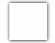
with the image on the right, you
can achieve the results that follow:
border-image:
url('drop-shadow.png') 70 repeat;
You're not likely to use this technique often,
but on occasion you may want more precise
control over a shadow than
box-shadow
allows.
border-image
is hard to override selectively. If you want
to scale an image across a background with the built
-
in
CSS support (if available) and
border-image
if not, you'll
need to use something like modernizr.js.
Creating gradients with CSS
Gradients
—smooth transitions from one color to another—have always
been popular with designers. In CSS2, the only way to implement a
gradient is to create it as an image in a graphics program and attach it
as a background to the element. This has problems and limitations, sev-
eral of which you're already familiar with:
Images don't always scale well, which can create problems when you
use an image as a background for content that's intended to scale.
❂
If you decide to change your color scheme slightly, you may have to
regenerate all your gradient images.
❂