HTML and CSS Reference
In-Depth Information
display: inline-block;
}
The
h1
is set to be
inline-block
so its
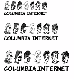
width shrink-wraps its content. Then
the background image is set to be a fixed
height and full width. You can see that
the image becomes distorted as the
width of the element forces it to stretch.
For this reason, this approach is suitable
only to allow for small changes in
expected element width.
If the text will stay the same but will
appear in different font sizes, it's possi-
ble to avoid the aspect-ratio issue. If you
know how wide the text will be, specify
the width and height in proportion to
the aspect ratio:
h1 {
background-image:
url('head-banner.png');
background-repeat: no-repeat;
padding-top: 2.18em;
display: inline-block;
background-size: 11.1em 2.18em;
}
section:nth-of-type(1) h1 {
font-size: 200%;
}
section:nth-of-type(2) h1 {
font-size: 250%;
}
section:nth-of-type(3) h1 {
font-size: 300%;
}
The ability to size backgrounds aligns well with vector graphics. In
chapter 3, you learned that
SVG
graphics, because they're vectors, are