HTML and CSS Reference
In-Depth Information
CSS3
makes the traditional background image approaches more flexi-
ble and provides declarative options for drop shadows, rounded cor-
ners, and gradients. Solutions that have involved images, JavaScript,
and extra markup can be replaced with simple
HTML
and
CSS
.
Drop shadows with CSS3
The pseudo-
3D
effect provided by drop shadows is a popular design
approach. In the past, designers have gone to great lengths to add this
visual effect, but
CSS3
saves a lot of time and resources by having the
functionality built in.
CSS3
defines two types of shadow: box and text. They use a similar
syntax:
text-shadow: rgb(0,0,0) 3px 3px 3px;
box-shadow: rgb(0,0,0) 3px 3px 3px;
A basic shadow, in either case, is defined by four values:
<color> <offset-x> <offset-y> <blur-radius>
The next section looks at what each of the
four values used to define a shadow does.
Box shadows
color
is any valid
CSS color value, such
as #6699cc,
rgb(102,153,204), or
rgba(102,153,204,255).
offset-x
is a CSS
length, such as 3px
or 0.5em. Negative
values are allowed.
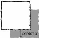
offset-y
is also a
CSS length; negative
values are allowed.
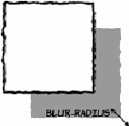
blur-radius
is also
a CSS length. Nega-
tive values aren't
allowed, but this
value is optional.