HTML and CSS Reference
In-Depth Information
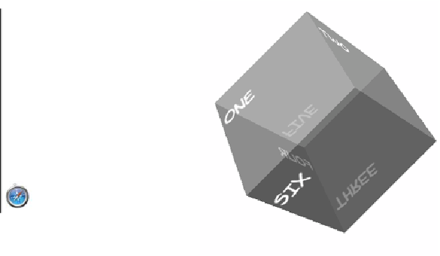
3D transforms
Tricks with
transform
,
translate
, and
skew
are entertaining, but they
aren't a substitute for real three-dimensional transformations. The
example in the previous section is subtly off—it doesn't represent a
proper perspective rendering of a cube and the sides don't quite line
up. Fortunately, the
CSS W
orking
G
roup is working on a standard for
transformations in three dimensions.
Full
Partial
-
12.0*
-
10.0*
-
10.0
-
-
-
4.0*
*
Support for 3D transforms requires
the presence of a compatible graphics
card driver.
This time, because you're making an actual cube in a
3D
space, you
need six elements to form the sides:
<div class="cube">
<div class="one"><p>One</p></div>
<div class="two"><p>Two</p></div>
<div class="three"><p>Three</p></div>
<div class="four"><p>Four</p></div>
<div class="five"><p>Five</p></div>
<div class="six"><p>Six</p></div>
</section>
The first step in
3D
transformations is to set a perspective. This defines
the depth of the
3D
space within which you'll be positioning the trans-
formed elements:
body { perspective: 1000; }