HTML and CSS Reference
In-Depth Information
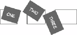
In this screenshot, the original posi-
tions of the elements have been
drawn in so you can more easily see
that each element is rotating around a
different reference point.
The
skew
functions allow you to create perspective-like effects. Hori-
zontal skewing is achieved with
skewX
and vertical with
skewY
:
div:nth-child(1) {
transform: skewX(16.5deg);
}
div:nth-child(2) {
transform: skewY(33deg);
}
div:nth-child(3) {
transform:
skewX(16.5deg) skewY(33deg);
}
It's also possible to move elements around on the page with
translateX
and
translateY
:
div:nth-child(1) {
transform: translateX(50px);
}
div:nth-child(2) {
transform: translateY(50px);
}
div:nth-child(3) {
transform:
translate(-50px, -50px);
}
Note that transforming elements doESn't affect the rest of your
layout; everything else remains in the place it would be if the there
was no transform. Transforms can be combined to create interesting
effects. In the following example, the three example elements have been
transformed into a pseudo
—
3D cube using skew, rotate, and translate.