HTML and CSS Reference
In-Depth Information
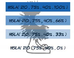
HSL
has a semitransparent equivalent:
HSLA
. Like
RGBA
, it has a final
parameter that specifies the percentage opacity:
.one {
background-color:
hsla(210,75%,40%,1);
color: hsl(210,75%,13.3%);
}
.two {
background-color:
hsla(210,75%,40%,0.66);
color: hsl(210,75%,13.3%);
}
.three {
background-color:
hsla(210,75%,40%,0.33);
color: hsl(210,75%,13.3%);
}
.four {
background-color:
hsla(210,75%,40%,0);
color: hsl(210,75%,13.3%);
}
Colors and transparency can add depth
and interest to your designs, but
everything is still basically a
collection of rectangles. If you want
elements at an angle, or text that runs
vertically, then with CSS2 you have to
resort to images. In
the next section,
you'll learn about
CSS3 transforms. They
let you rotate, skew,
translate, and scale
elements to create an
interesting variety
in your designs.
CSS transforms
Full
Partial
-
7.0
In chapter 3, you learned about transforms
using the
<canvas>
element and
SVG
—these let
you rotate, scale, and skew elements. Similar
functionality is made available as part of
CSS3
. Because everything uses the same ren-
dering engine (the browser), this shouldn't be
too surprising. It's already implemented—the
browser is just offering different ways to acti-
vate it. Transforms allow your designs to
escape the rectangular world of standard web
pages.
-
3.5
-
9.0*
-
10.5
-
3.1
*
IE has been able to do transformations
with the nonstandard
filter
attribute
since version 5.5.