HTML and CSS Reference
In-Depth Information
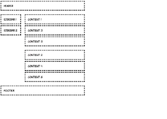
640px width
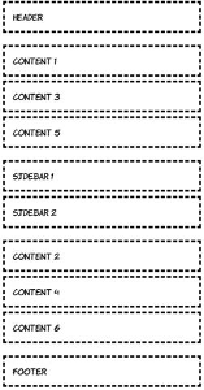
480px width
To start with, define the single-column, small-screen layout:
body {
display: grid;
grid-rows: auto;
grid-columns: 1fr;
}
header { grid-row: 1; }
#sidebar { grid-row: 3; }
#content1 { grid-row: 2; }
#content2 { grid-row: 4; }
footer { grid-row: 5; }
For windows 600 pixels wide and greater, you'll switch to a two-
column layout. Note that although the grid can be easily redefined on
the
body
rule, the elements must be explicitly slotted into that grid:
@media screen and (min-width: 600px) {
body {
grid-columns: auto 1fr;
grid-rows: auto 1fr 1fr auto;
}