HTML and CSS Reference
In-Depth Information
For collections of elements that do have an intrinsic width, flexboxes
offer an ability that can't be replicated by tables,
display: table
,
float
s,
or
inline-block
: they can create flexible grids that can have a variable
number of elements per row, as with
float
s and
inline-block
, but the
individual elements flex so they exactly fill up each row, as with table
rows and
display: table
. This is thanks to the
multiline
property. The
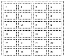
following example has a grid of 60 cells, each containing a number.
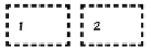
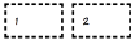
800px
640px
480px
At different widths, a different number
of elements fit on each row. If you zoom
in on a few cells, you can see that they're
also slightly different widths depending
on the size of the container.
800px
640px
480px
Following is a snippet of the markup (left) and the
CSS
(right)
required for this layout. The key property is
box-lines
:
<ul>
<li>1</li>
<li>2</li>
<li>3</li>
<li>4</li>
<li>...
...</li>
</ul>
ul {
display: box;
box-lines: multiple;
}
li {
display: block;
box-flex: 1;
min-width: 3em;
}