HTML and CSS Reference
In-Depth Information
#msg480,
#msg801 { display: none; }
#msg800 { display: inherit; }
}
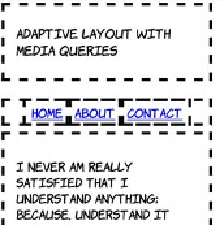
Finally, at a width of 480 pixels or less,
the layout becomes single column.
The majority of the required rules for
this layout were specified in the less-
than-800 pixels example. These rules
mostly adjust the size of elements to
allow more content to appear on a
mobile screen:
@media screen and (max-width: 480px) {
h1 { font-size: 105%; }
nav { padding: 0; }
nav a { margin: 0; padding:
0.25em 0.5em; }
article,
aside { display: block; width: auto; }
#msg800,
#msg801 { display: none; }
#msg480 { display: inherit; }
}
Following are screenshots of the same page on an Android phone in
portrait mode (left) and landscape mode (right).
Portrait (480px width)
Landscape (800px width)