HTML and CSS Reference
In-Depth Information
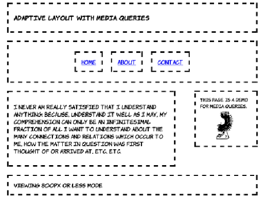
This layout is implemented with two sets of rules within media queries.
The first provides a set of rules to be applied for any width less than
800 pixels, and the second is a set of rules that's applied only when the
window is between 481 and 800 pixels wide. This approach saves
repeating rules:
@media screen and (max-width: 800px) {
div { display: block; overflow: hidden; margin: 0; }
nav { display: block; width: auto; }
nav ul { display: table; border-collapse: collapse;
margin: 0 auto; }
nav li { display: table-cell; }
}
@media screen and (max-width: 800px) and (min-width: 481px) {
h1 { font-size: 110%; }
article,
aside { display: block; }
article { width: 60%; float: left; margin-right: 0; }
aside { width: 20%; font-size: 80%; float: right;
margin: 1.2em; margin-left: 0; }
img { max-width: 60px; }