HTML and CSS Reference
In-Depth Information
width: 54%;
}
aside {
margin-right: 0;
width: 25%;
}
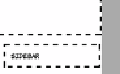
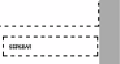
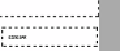
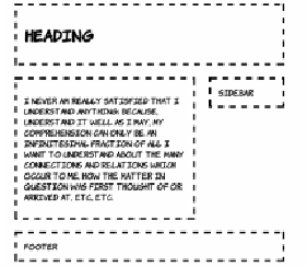
You can see that the sidebar is poking out to the right of the header and
the footer. The problem is worse than it appears because how much the
sidebar pokes out depends on many factors. The following screenshots
show the alignment of the sidebar with the footer at various browser
window sizes (the gray bar has been added so you can more easily see
the variation, and the sidebar and footer are shown next to each other
for convenience).
640px width
800px width
1024px width
1280px width
These issues are bound to occur when combining
CSS
lengths of differ-
ent types. The number of pixels taken up by an em or a percentage will
vary depending on font size and window size. On the other hand, it's
rare that you'll want something like a border to be a different width
depending on the width of the browser window.
CSS3
provides the
calc
function to allow you to combine different units in a predictable way.
Take the earlier example
CSS
and,
assuming everything else remains
the same, you can change the
widths to the following:
section, aside {
width: calc(70% - 4.665em);
}
aside {
width: calc(30% - 3.665em);
}