HTML and CSS Reference
In-Depth Information
SVG
is a large specification, and there's more than one way to achieve
this same effect. Instead of applying the image as a background to the
text, the text can be used to clip the image. To create a mask, the main
change is that the text should be filled with white:
<mask id="img1" clipPathUnits="userSpaceOnUse" width="320"
height="200">
<text x="0" y="120" font-family="sans-serif"
font-size="80" font-weight="bold" fill="white">
<tspan>HTML5</tspan>
<tspan x="0" y="180" font-size="70">ROCKS!</tspan>
</text>
</mask>
Then attach the mask to the
<image>
element with the
mask
attribute:
<image xlink:href="uf009705.png"
mask="url(#img1)"
x="-10" y="-5"
width="340" height="220" />
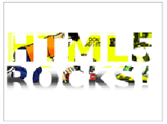
The image is positioned to approxi-
mate the previous example; see the
code in ch03/svg-17-clippath.html.
We'll finish our tour of the advanced features of SVG with a
quick look at the declarative animation capabilities it
offers. In the following screenshots, the text
—
pattern
example has been animated to move down and then back up again.