Database Reference
In-Depth Information
1.
Return to Layout mode and click once on your chart to select it. Over in the In-
spector window, select the Position tab and, in the Autosizing section, activate the
bottom and right anchors
.
All four anchors should now be active. This will cause your chart to stretch with the
size of your window when you're back in Browse mode.
2.
Before you switch to Browse mode, however, select Format
→
Chart Setup (or
simply double-click the chart)
.
You return to the aptly named Chart Setup dialog box.
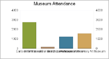
Figure 15-17. Sure it's a chart, but is it art? This chart's X axis contains some unfortu-
nately long museum names. FileMaker isn't quite crafty enough to sort this problem out by
itself, but the tools to correct it lie in the Format Chart options.
3.
On the top-right side of the Chart Setup dialog box, go to the Chart panel. (You
can see it in
Figure 15-18
.
)
Your chart's X Axis lists the various museums in the report, but that's not explicitly
stated on the chart.
4.
In the X-Axis Title box, type
Museum Name
. In the Y-Axis Title box, type
At-
tendees
.
They Y axis graphs the number of people who visited each museum.
5.
Under Axis Options, click the X-Axis tab to select it and change the Label Angle
to
22
.
6.
Click Done and then switch back into Browse mode to admire your handiwork
.
Now you've got a usable chart that's clean, readable, and appropriately labeled, your chart
should look something like
Figure 15-19
.