Database Reference
In-Depth Information
UP TO SPEED: CHECKBOXES BEHIND THE SCENES
The beauty of checkbox set fields is that they let folks click
more than one
checkbox. In other
words, you can capture several values in one easy-to-use field. This method comes in handy when
the things you're tracking in your database have fields like Available Sizes, Available Colors, Ware-
houses, or any other attribute of the
one or more
variety. But wait, you say—how can a single field
hold
more
than one value?
Simple, if you're FileMaker, by giving the value of each checked box its own line. In other words, if
you have a checkbox set showing colors, and you turn on Red, Green, and Blue, FileMaker actually
thinks of the field like this:
Red
Green
Blue
You can show the same field on another layout—or even the same layout if you want—without the
checkbox formatting. If you do, you see the selected items: one on each line. This is called a
“return-separated list.” If you change what's in the field without using the checkboxes, then you
could end up with lines that don't match any of the value list items. In that case, the checkbox set
turns on its Other item if it has one. (If not, the extra items simply don't show at all.)
A final note: Because checkbox sets may hold several values on separate lines in the field, they're
really suitable only for
text
fields. Other field types don't support multiline values.
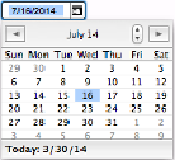
Figure 7-26. The drop-down calendar makes entering dates a snap. It has some sweet controls, too.
When the field is empty, the current date is highlighted when the field drops down. Or, if there's
data in the field already, then FileMaker highlights that date when the calendar appears.
NOTE
Like the show/hide arrow on drop-down lists, the calendar icon shows up in an inactive field only if
the field has a border. If you're a minimalist on the field border issue, you can format your field with
only a right border to force the icon to appear.