Database Reference
In-Depth Information
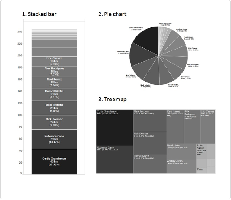
Figure 5-10. Three alternative ways to show the proportion of home runs hit by each player
Do you feel that any of the three views in
Figure 5-10
is an improvement over the simple bar
chart in
Figure 5-9
? What about the dot chart shown in
Figure 5-11
?
Each has its own merits, though the pie chart doesn't really have many. In the pie chart, I
can't really tell any difference between the pie slices in the middle. There are just too many
slices to discern among them.
I'd elect to use the dot chart shown in
Figure 5-11
. It lets us make quick comparisons and see
the relative and absolute amounts, and it makes the rank order immediately obvious.