Database Reference
In-Depth Information
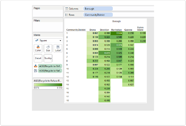
Figure 4-8. The highlight table with Rows and Columns swapped
Tableau has defaulted to a sequential green color palette, meaning the gradient increases pro-
portionately with increasing
Recycle to Refuse Ratio
. Our eyes can easily pick out the
darkest cell, and we also find the lightest rather easily. Most people can distinguish between
about six different levels of intensity. If the goal were to communicate the precise values, we
could have created a simple table without the highlights. Adding the highlights makes it easi-
er to quickly compare cells and find the highest and lowest values.
It's still not immediately obvious which community district has the second-highest ratio,
though. Our eyes have to dart around to all the dark cells and read and memorize the values.
Eventually we settle on Brooklyn community district #6 as having the second-highest ratio,
but the task gets harder as we move along. Which has the third highest? The fourth? Is there
an easier way to facilitate this assessment of rank?
What we'd like is a simple list of community districts in descending order of the ratio. To
make this list, let's first create a new field that combines the
Borough
and
CommunityDis-
trict
fields into a single Dimension.