Database Reference
In-Depth Information
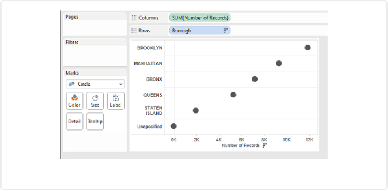
Figure 3-15. Dot chart of count of rat sightings by borough
Histograms: How Many of How Much?
In both of the previous examples—garbage collection and rat sightings—the independent
variable in the category was borough, which is a nominal variable. It was fairly easy to sum
measurements or count instances for each borough.
But what if the independent variable is ordinal or quantitative? For example, returning to the
garbage collection example, what if I wanted to show how many community districts yielded
certain amounts of refuse?
One way to show counts of quantitative variables is the histogram, which was
first intro-
duced by the father of mathematical statistics, Karl Pearson
,
in 1895. The histogram is very
straightforward to build in Tableau using the
Show Me
panel. In the DSNY workbook, click
the
RefuseTonsCollected
field in the Measures panel, click to open the
Show Me
panel in
the upper right, and then select
histogram
in the bottom row of options.
Tableau creates the histogram shown in
Figure 3-16
.