Database Reference
In-Depth Information
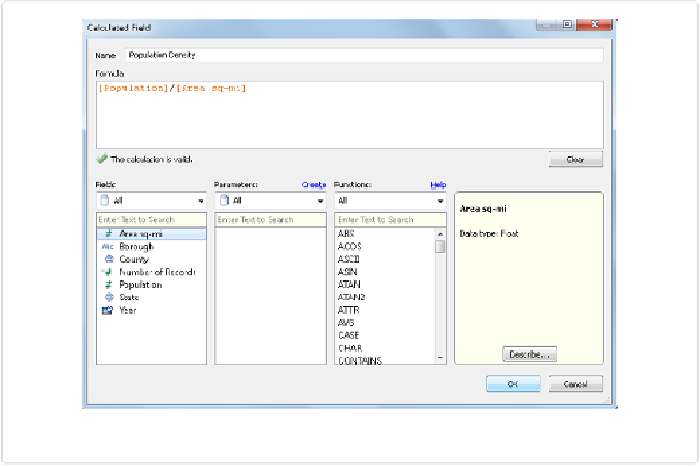
Figure 2-11. Creating a calculated field
After clicking OK, you will notice that a new continuous field called
Population Density
appears in the Measures area with an
=
to the left of it, indicating a calculated field.
Creating visualizations
Tableau features a simple drag-and-drop interface that allows the user to quickly explore dif-
ferent data visualization types. For example, dragging
Borough
onto the Columns shelf,
Pop-
ulation
onto the Rows shelf, and
Population Density
onto the Color shelf results in the
column chart shown in
Figure 2-12
.
This chart shows that while Brooklyn has the largest population as indicated by the tallest
column, Manhattan has the highest population density as indicated by the darkest green
shade.