Database Reference
In-Depth Information
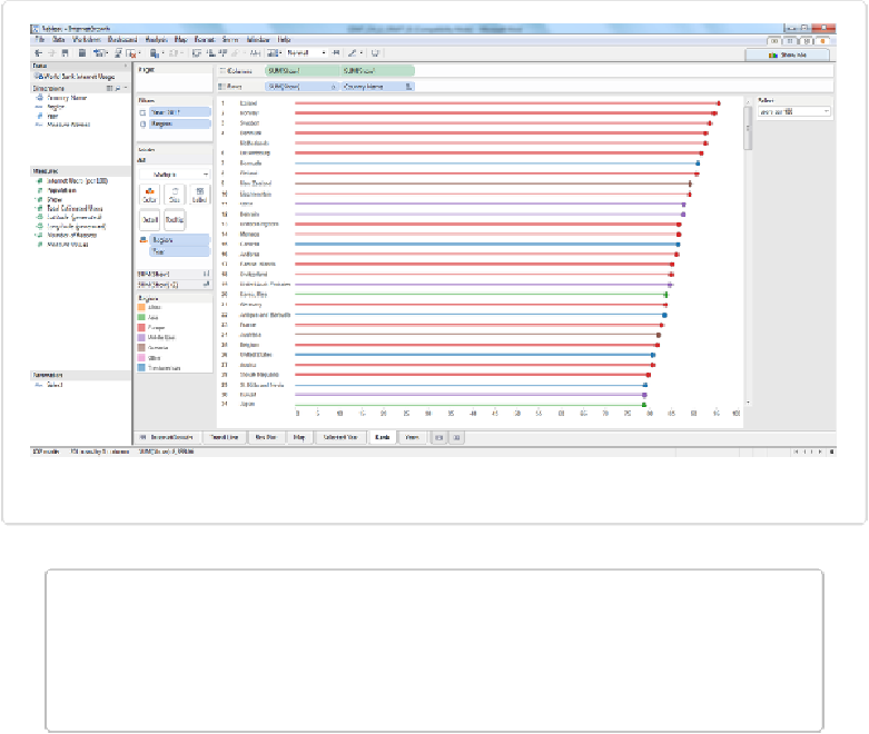
Figure 13-6. The dual-axis bar chart colored by region with rank added
NOTE
Make sure to give each visualization an appropriate name; I renamed them “Map,” “Trend
Line,” and “Rank.” That will make it much easier when we go to add them to the Dash-
board not to have to deal with “Sheet 1,” “Sheet 2,” and so on.
One important detail is the Rank column we have added at the far left of the bar chart. We
used the Rank table calculation to add it as follows:
1. With the basic dual-axis bar chart already created, drag
Show
to the Rows shelf to add
the green
SUM(Show)
pill.
2. Click on the down arrow in the green
SUM(Show)
pill on the Rows shelf and change it
to
Discrete
. The pill changes from green to blue.
3. Click on the down arrow again and select
Quick Table Calculation
→
Rank
.