Database Reference
In-Depth Information
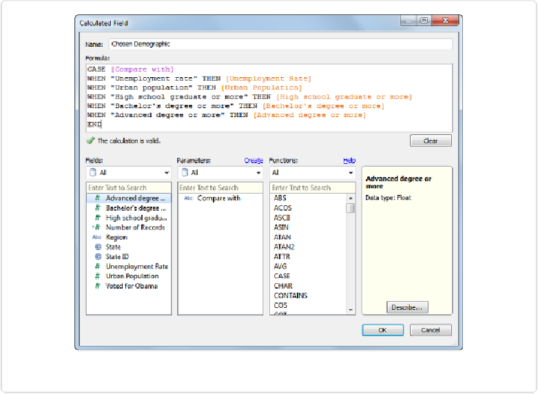
Figure 11-19. Creating a Calculated Field for the Parameter to control
Now that we have this calculated field called “Chosen Demographic” in the Measures area,
let's use it to create a scatterplot comparing the various state demographics with the voting
record using the following nine steps:
1. Drag
Chosen Demographic
to the Columns shelf.
2. Drag
Voted for Obama
to the Rows shelf.
3. Drag
State
to the Level of Detail.
4. Change the Marks type from
Automatic
to
Filled Map
.
5. Click the Size card and increase the size to the second notch.
6. Drag
State ID
to Label.