Database Reference
In-Depth Information
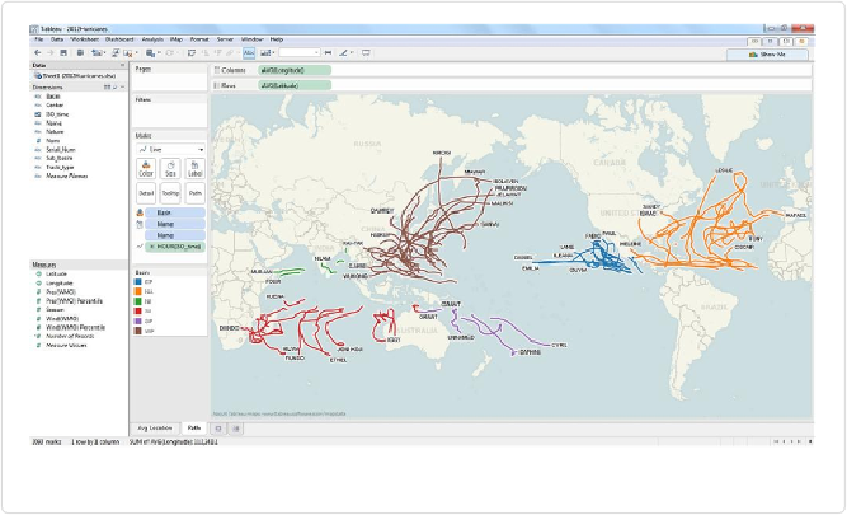
The resulting hurricane plot is shown in
Figure 11-13
.
Figure 11-13. Hurricane plot showing the route of each hurricane of 2012
Notice that each line has an identical weight, so while we can visualize the path traveled by
each storm, we can't see the relative strength or size of each storm. Notice that the table in
speed (in knots) of each hurricane at each point in time.
We can drag this field to the Size shelf, move
Basin
to the Filters shelf and
Place Name
to
the Colors shelf to get the updated hurricane map shown in
Figure 11-14
.
This is a great way to show the entire 2012 hurricane season in one snapshot. What isn't
shown, though, is
when
these hurricanes occurred during the course of the year. To see the
hurricanes move their way across the map, drag
ISO_time
to the Pages shelf, change the pill
to
DAY(ISO_time)
, check the “Show History” box, and then press the
Play
button, as shown
in
Figure 11-15
.
This type of animated data visualization can leave a lasting impression on an audience, as the
viewers get a sense of the 2012 hurricane season “playing out” in front of their eyes.