Database Reference
In-Depth Information
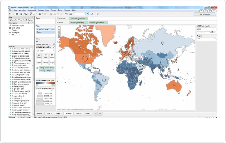
Figure 10-21. A dual-axis map showing both rate (color) and number (circle sizes) of Internet
users
If we pause a moment to take a look at what we've created, we'll notice that this version of
the map would probably be slightly more intimidating to the first-time viewer. We're com-
municating two different measures via totally separate encodings, so viewers will need to in-
vest a little more time to “learn the map,” especially if we don't have the luxury of explain-
ing it to them in person. Once they understand the cipher though, they'll get more in-depth
insights in return.
Viewers can easily see, for example, that while the rate of Internet users in China is relatively
low (light blue color), it represents the highest absolute number of Internet users in any coun-
try in the world in 2010. That might not be very surprising, but other interesting comparisons
can be made. Compare Japan with India, for example. Both had around 100 million Internet
users in 2010, but Japan had a much higher rate of adoption. The Scandinavian countries,
while still the darkest on the map, contribute a fairly low total number of users to the global
pool. These types of comparisons can be made relatively quickly with this type of map.