Database Reference
In-Depth Information
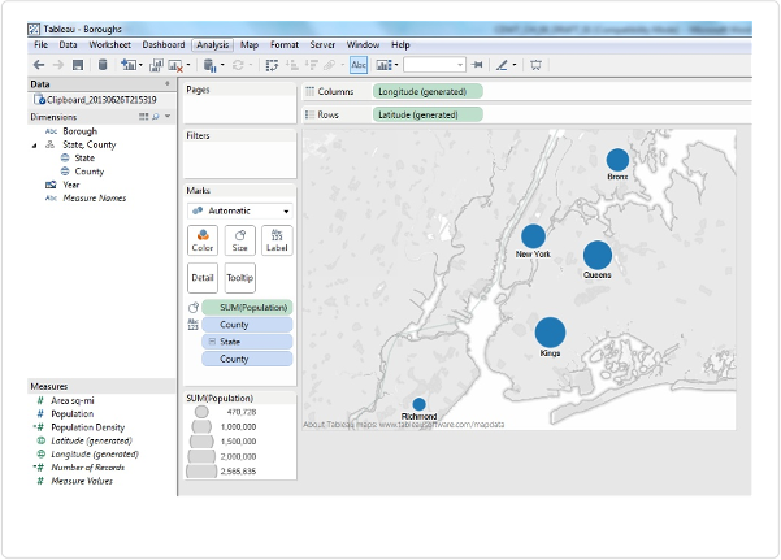
Figure 10-4. Circle map with circles sized by a Measure
We can do this with any numeric data field type, but it's best to use Continuous (green)
fields, as they will result in maps with circles that are sized proportionately to the quantity.
You can change the sizing by clicking on
Size
and moving the slider up or down. To create
the map in
Figure 10-4
, I dragged the Size slider to the second notch, which increased the
size of each of the circles proportionately. I also added
County
to the Label shelf so that
those less familiar with New York will be able to know the place names.
Now we can see the circles and their size and position relative to each other, but comparisons
aren't as precise as they are with bar lengths. Is the circle for New York county larger or
smaller than the circle for Bronx county? How much larger is the population in Kings than in
Richmond? Why not just make a bar chart, then? The map adds something to the equation:
relative position.