Database Reference
In-Depth Information
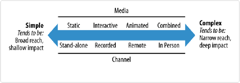
▪ Static, interactive, animated, or combined graphics?
▪ If narrated: recorded, live, or both?
▪ If live: remote, in person, or both?
▪ In all cases: broadcast, directed, or both?
The framework in
Figure 1-9
shows how these choices typically relate in terms of effort,
reach, and likely impact.
Figure 1-9. A spectrum of data communication types
On the one hand, it's obviously very simple and easy to create a static chart and send an
email to a group of colleagues or publish it to the Web as a standalone graphic. This ap-
proach to communicating data could have a very deep impact on your target audience, but it
most likely will not. It's also important to note that the cost in time and effort is very low.
On the other hand, narrating a combined set of static and dynamic graphics in person to a
live audience is a very complex endeavor. A limited number of people will be present, but if
you pull it off like Hans Rosling has, the impact could be enormous. The effort is high (and
don't forget to rehearse).
These are both extreme examples of communicating data. The area in between these two ex-
tremes includes publishing blog posts that combine interactive data visualizations and de-
tailed commentary—something Tableau Public makes very easy to do.
As with anything, there is a trade-off between cost and impact at play here. If your target
audience is a small firm in South Africa and the stakes are high, for example, getting on an