Database Reference
In-Depth Information
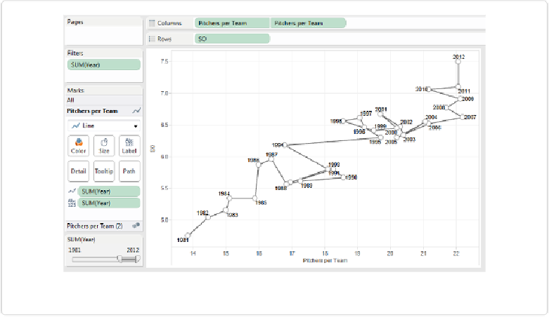
Figure 9-13. The formatted connected scatterplot
Take a look back at the different ways of showing the change in average strikeouts per game
and pitchers per team over time. Which would be most effective in communicating this data
to an audience? The answer depends on which insights we want to highlight, and how “cap-
tive” the audience is:
▪ Can we be present to explain the chart to the audience or not?
▪ Are they highly motivated to understand the content or not?
If the answer to either of these questions is “yes,” then a connected scatterplot may work just
fine. If the answer to both is “no,” then the connected scatterplot is a risky choice.