Database Reference
In-Depth Information
As we seek to communicate how quantities change over time, we'd do well in most cases to
follow Playfair's lead and place time on the x-axis, proceeding from left to right. This orient-
ation will be well understood by those we are communicating with, and they'll need to invest
relatively little time and effort to begin gleaning insights from what we show them.
Let's look at some examples.
The Line Chart
(
Tms
), and the total number of pitchers (
#Pitch
) of each professional baseball season (
Year
)
since 1871. In this data set,
Year
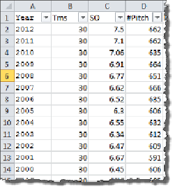
is a simple quantitative measure. An image of the data set is
shown in
Figure 9-2
.
Figure 9-2. Average game stats data set
In order to visualize how these variables have changed over time, we can first connect
Tableau to the spreadsheet, and then take the following steps to create a line chart:
1. Left-click the Measure
SO
, and drag and drop it onto the Rows shelf.
2. Right-click on the Measure
Year
, and drag it to the Columns shelf. When you release
the right mouse button, select the top option,
Year
.