Database Reference
In-Depth Information
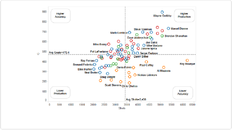
Figure 8-22. The completed quadrant scatterplot
This is an interesting way of grouping the players. If you want, you can add the trend line
back to the quadrant view and use both comparison aids together. I'd recommend going with
soft, light lines if you do so, as you don't want to obstruct the data points themselves with
thick, dark lines.
Summary
In this chapter, we explored but a few of the ways to compare multiple variables at the same
time, and my admiration of the scatterplot has been evident. We also touched on annotations
and background images, topics we'll pick up again later. In addition, we exlored how to cre-
ate stacked bar charts using Measure Names and Measure Values, a tricky technique that is a
little mind-bending at first, I'll admit. Lastly, we covered how to add trend lines and referen-
ce lines to aid in comparison.
In the next chapter, we'll explore the all-important factor of time.