Database Reference
In-Depth Information
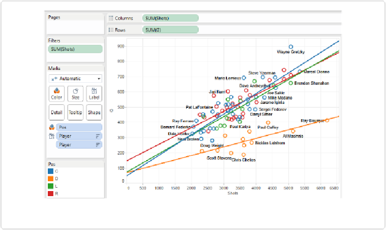
Further notice that the axes do not have the same ranges. While both start at 0, the y-axis ex-
tends upward to just under 1,000 goals, while the x-axis extends to the right past 6,500 shots.
This is typical of scatterplots, as the primary goal is to understand the nature of the grouping
of the points. Having the axes be of equal length would result in the data points lying very
close together above the x-axis, making it difficult to see any trend.
How do we add trend lines? Just right-click anywhere in the grid defined by the axes and se-
lect
Trend Lines
→
Show Trend Lines
. The resulting view shows four trend lines, one for
each position, as shown in
Figure 8-16
.
Figure 8-16. Scatterplot with multiple trend lines
As we can clearly see, defensemen (the orange line) have a very different shots-to-goals rela-
tionship than the offensive players, whose trend lines are all very similar.
If we want to show only one trend line for all of the points together, we can right-click any-
where in the grid area and select
Trend Lines
→
Show Trend Lines
. Then, we can uncheck
the box that says “Allow a trend line per color”—and I'd also recommend checking “Force
y-intercept to zero,” because no shots means no goals. The resulting view is shown in
Fig-
ure 8-17
.